The noclune brand
Logos, colours and type for anyone writing about noclune or linking to it, free to use for that as long as they stay the way they're drawn.
Logos
The lockup puts the mark above the name, the wide lockup sets them side by side, and each comes in a light version for dark backgrounds and an ink version for light ones.







App icon
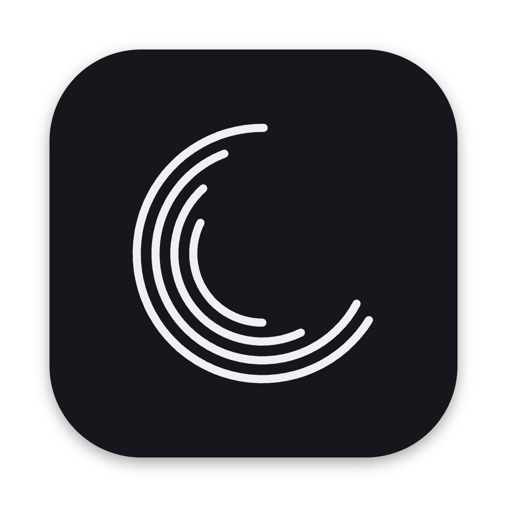
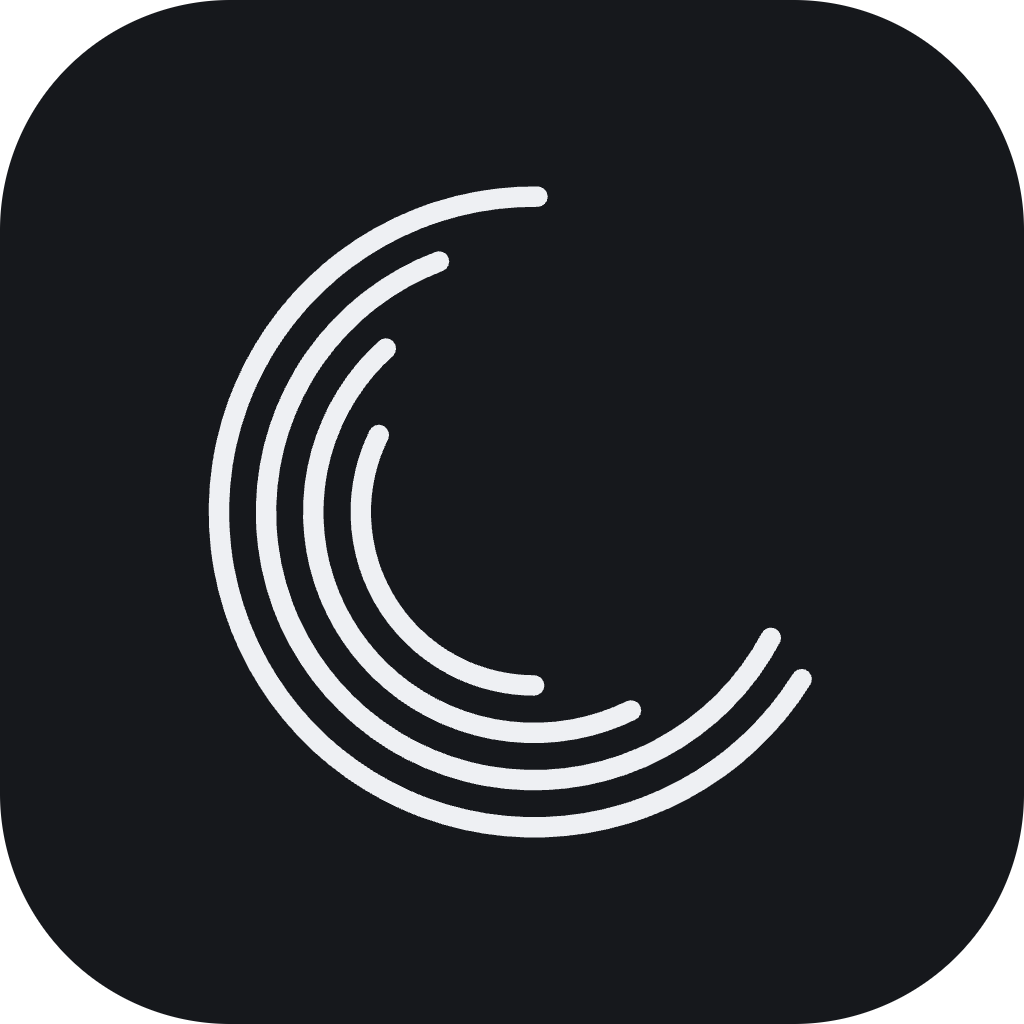
The mark on its graphite tile is the app's icon, with versions drawn for 16 to 64 px so the grooves stay clear at small sizes, and a macOS version with its own shadow.










The name
noclune
Always lowercase and one word, even at the start of a sentence or in a title.
- noclune plays it gapless.
- Noclune, NoClune, NOCLUNE, noc lune
Colours
A graphite and near-white palette, with all other colour coming from the music, and one amber the app keeps for state, such as what's playing.
Type
IBM Plex in three cuts, all under the SIL Open Font License, and since the wordmark is drawn as strokes, use the files instead of typing it in a font.
Aa
IBM Plex Sans
Headings and the interface, 400 to 600, with tabular figures
AA
IBM Plex Sans Condensed
Small printed labels in capitals, 600
a1
IBM Plex Mono
Hashes and numbers that have to line up, 400
Using the logo
- Leave clear space around it of at least half the mark's height.
- Use the light version on dark backgrounds and the ink version on light ones, or the tile version on photos and busy backgrounds.
- Below about 64 px use the app icon, which has versions drawn for small sizes.
- Recolour it, add amber, outline it or add shadows and glows.
- Stretch, rotate, rearrange or re-type the wordmark.